
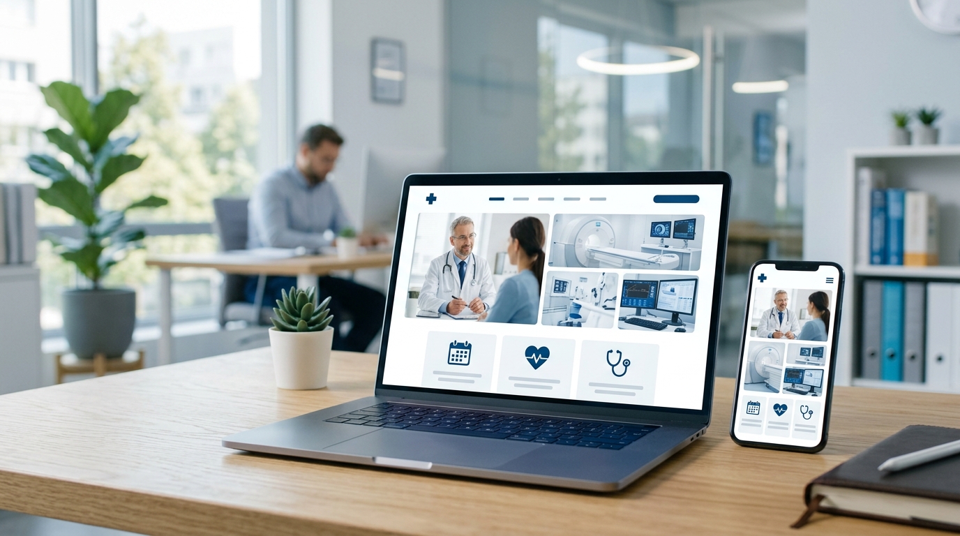
Is Your Website Turning Away New Patients?
Check your phone. It’s likely within arm’s reach. Now, imagine a potential patient searching for a dental clinic or medspa in a moment of need. They find your practice on Google, tap the link, and are met with a website that’s impossible to read. They have to pinch, zoom, and struggle to find your phone number. They will leave in seconds.
This scenario plays out every day. In today’s digital world, your website is your virtual front door, and most patients are knocking from a mobile device. A website that isn’t optimized for mobile isn’t just an inconvenience; it’s a significant barrier to growing your practice.
First Impressions Matter: The Patient Experience on Mobile
The modern patient journey begins online. Before a patient ever steps into your office, they form an opinion based on your digital presence. A clunky, slow, or hard-to-navigate mobile website creates immediate friction and frustration. This poor user experience reflects directly on your practice’s perceived professionalism and attention to detail.
Think about it. If your website is difficult to use, a potential patient might wonder if your practice is equally disorganized or outdated. Trust is essential in the medical and aesthetic fields. A clean, intuitive mobile experience shows that you are modern, accessible, and care about making things easy for your patients from the very first interaction.
Google’s Mobile-First Indexing and Your Visibility
Beyond patient perception, a mobile-friendly website is a critical factor for search engine optimization (SEO). Google now operates on a “mobile-first” indexing model. This means Google primarily uses the mobile version of your content for indexing and ranking, even for searches performed on a desktop computer.
If your mobile site provides a poor experience, your search rankings will suffer across all devices. This directly impacts your ability to attract new patients searching for the services you offer. A non-responsive design can lead to:
- Lower Rankings: Your competitors with mobile-optimized sites will appear above you in search results.
- Higher Bounce Rates: When users quickly leave your site out of frustration, it signals to Google that your page isn’t helpful, further hurting your ranking.
- Lost Opportunities: Fewer people will find your practice organically, forcing you to rely more on paid advertising.
Key Features of a Great Mobile Medical Website
So, what exactly makes a medical or aesthetic website “mobile-friendly”? It goes beyond just shrinking your desktop site onto a smaller screen. It requires a thoughtful design focused on the on-the-go user. Here are some essential elements:
- Responsive Design: The website layout should automatically adapt to fit any screen size, from a smartphone to a tablet, ensuring a perfect view every time.
- Click-to-Call and Click-to-Map Functionality: Patients should be able to call your office or get directions with a single tap. Don’t make them copy and paste information.
- Simplified Navigation: Use a clear, concise menu that is easy to tap. Important pages like “Services,” “Contact,” and “Book Appointment” should be immediately accessible.
- Fast Loading Speed: Mobile users expect speed. Every second of delay increases the chance they will leave. Your images and code should be optimized for quick loading.
- Readable Text and Sized Buttons: Fonts must be large enough to read without straining, and buttons must be spaced out enough to be easily tapped with a thumb.
Turning Mobile Visitors into Booked Appointments
Ultimately, the goal of your website is to convert visitors into patients. A well-designed mobile site removes the barriers that prevent people from taking that next step. When information is easy to find and the booking process is straightforward, you’ll see a direct increase in appointment requests.
Clear, prominent calls-to-action like “Book Your Consultation Now” guide the user through the process. Your online forms should be simple, with a minimal number of fields, making them quick to complete on a small screen. A great mobile experience builds confidence and encourages a user to commit.
Your website is one of your most important business assets. Ensuring it performs flawlessly on mobile devices is not just a technical upgrade; it’s a fundamental part of your patient acquisition strategy. If your website isn’t performing on mobile devices, you’re leaving opportunities on the table. To ensure your practice makes the best first impression online, talk to the experts at InfoEmpire. Call us today for a consultation at 877-482-4678.