
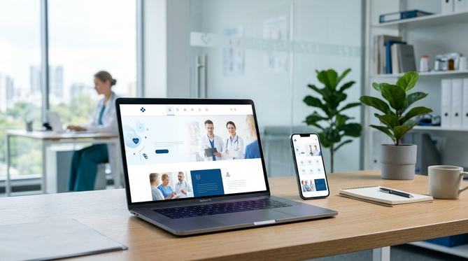
Your Next Patient is Probably on Their Phone Right Now
Take a moment and picture a potential patient. They could be searching for a new dentist during their lunch break, looking for a medspa for a specific treatment, or needing to book a check-up. Where are they doing this search? Overwhelmingly, the answer is on their smartphone. If your practice’s website isn’t designed specifically for that mobile experience, you are likely losing that patient before they even find your phone number.
In today’s digital world, a website that simply shrinks to fit a smaller screen is no longer enough. Your practice needs a mobile-first approach to web design. This strategy is essential for attracting new patients, providing a better user experience, and ultimately growing your practice.
What is a Mobile-First Approach, Really?
Many people confuse a mobile-first design with a responsive design. While a responsive site adjusts to different screen sizes, a mobile-first strategy involves designing the website for the smallest screen, the smartphone, and then working up to larger screens like tablets and desktops. This is a fundamental shift in thinking.
It forces you to prioritize the most critical information and actions a patient needs. Think about what someone on the go wants: your phone number, your address, a simple way to book an appointment, and a quick overview of your key services. A mobile-first design puts these elements front and center, creating a clean, fast, and frustration-free experience.
Google Prioritizes Mobile, and So Should You
For several years now, Google has used mobile-first indexing. This means Google’s search engine crawlers primarily look at the mobile version of your website to determine its ranking, even for desktop searches. If your mobile site is slow, difficult to navigate, or has less content than your desktop site, your search engine ranking will suffer across the board.
A poor mobile experience directly tells Google that your site is not valuable for the majority of users. For a local medical or aesthetic practice that depends on being found in searches like “dentist near me” or “Botox in [City]”, being invisible on Google is a major business problem.
The Modern Patient Journey Begins on a Small Screen
A clunky mobile website does more than just hurt your SEO. It actively damages your practice’s reputation. When a potential patient has to pinch and zoom to read text, struggles to click a tiny button, or waits for large images to load, they get frustrated. That frustration is immediately associated with your brand.
They will not wait. They will simply hit the back button and click on your competitor’s link. A professional, easy-to-use mobile website builds trust and confidence from the very first click. It shows that your practice is modern, attentive to detail, and cares about the patient experience before they even step through your door.
Key Elements of a Patient-Focused Mobile Website
So what does a great mobile-first medical website look like? It prioritizes clarity and action, focusing on these essential features:
- Effortless Navigation: A simple, clear menu that helps visitors find what they need in just a few taps. Key pages like Services, About Us, and Contact should be immediately accessible.
- Click-to-Call and Map Integration: Make it incredibly easy for a mobile user to call your office or get directions directly from your site with a single tap.
- Fast Page Speed: Mobile users are impatient. Your site must load in three seconds or less, or you risk them leaving. This means optimizing images and using clean code.
- Simple, Secure Forms: Appointment request and contact forms should be short, with large fields that are easy to fill out on a mobile device.
- Readable Content: Use clear fonts, short paragraphs, and a high-contrast color scheme to ensure your content is easily scannable on a small screen.
Investing in a mobile-first website is not just a technical upgrade. It is a core business strategy for any modern medical, dental, or aesthetic practice. It’s about meeting your patients where they are and providing an experience that builds trust from the very first interaction.
If your website isn’t built for today’s mobile patient, you are falling behind. To discuss how a true mobile-first website can transform your patient acquisition, call the experts at InfoEmpire today at 877-482-4678.